IMAGE RESIZER / SCREENSHOT TEXT
Why is screenshot text tiny after resizing?
Shrinking a complete screenshot shrinks its text along with everything else. If the message matters more than the surrounding interface, crop a focused excerpt before resizing and keep the full original separately. Our synthetic panel compares these two layouts at the same final width. It shows the geometry tradeoff, without claiming a universal minimum readable font size.
Check how much of the width belongs to the message
A full-screen capture can spend most of its width on navigation, empty margins or other panels. Fitting all of that into a narrow column leaves fewer pixels for each letter. Choosing a different file extension does not change that geometry. Decide whether the receiver needs the whole screen or a clearly labeled excerpt.
A controlled panel with known text
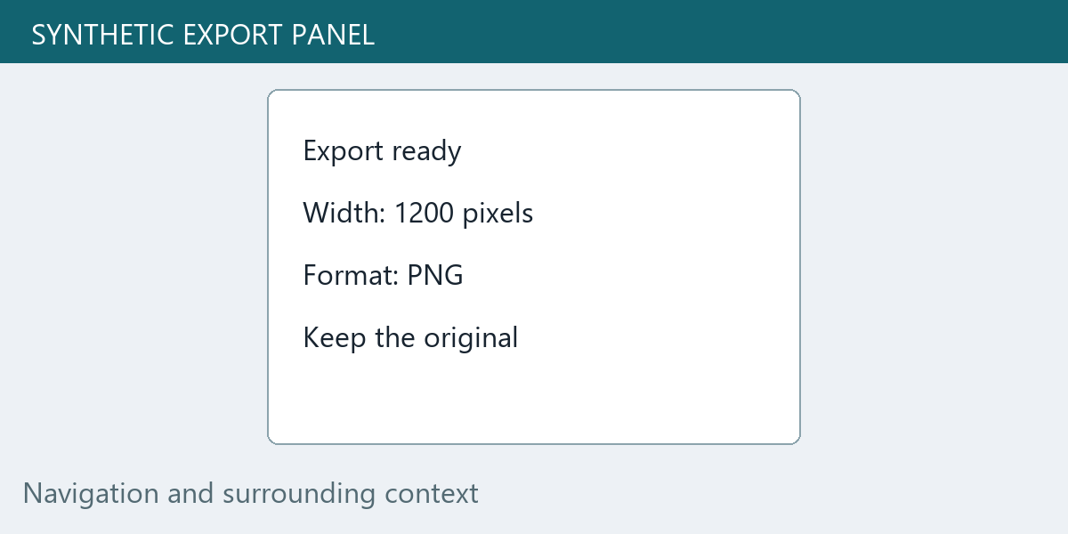
We drew an original 1,200 × 600 RGB interface illustration containing a white panel, a header and surrounding context. Inside the panel we rendered four lines in Segoe UI at a nominal 32-pixel font size: “Export ready”, “Width: 1200 pixels”, “Format: PNG” and “Keep the original”. This is a synthetic fixture, not a capture of an actual account or application.
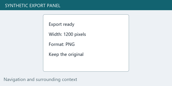
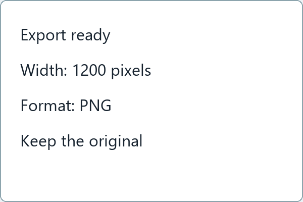
We exported the complete fixture at widths of 600 and 300 pixels, keeping its two-to-one aspect ratio. Separately, we cut out the rectangle from source coordinate (300, 100) up to but excluding (900, 500). That crop is 600 × 400 pixels. We then resized this excerpt to 300 × 200. Every output uses one Lanczos resize and a lossless PNG save; no sharpening or JPEG encoding is mixed into the comparison.
| Output | Input grid | Final grid | Scale | Nominal text-size equivalent |
|---|---|---|---|---|
| full-600 | 1200 × 600 | 600 × 300 | 0.5 | 32 × 0.5 = 16 |
| full-300 | 1200 × 600 | 300 × 150 | 0.25 | 32 × 0.25 = 8 |
| crop-300 | 600 × 400 | 300 × 200 | 0.5 | 32 × 0.5 = 16 |
Same output width, different space for the letters
The full image reduced to width 300 uses a scale of 300 ÷ 1,200 = 0.25. Its nominal 32-pixel type scales to an eight-pixel equivalent. The excerpt uses 300 ÷ 600 = 0.5, giving a 16-pixel equivalent. Both outputs are 300 pixels wide, but the excerpt allocates twice the linear scale to the same source lettering. This calculation is about the original font setting and geometric scale; actual glyph ink height is not identical to nominal font size.
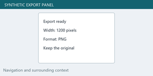
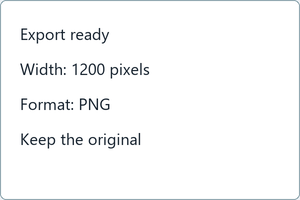
These two images are shown at their saved width when the layout has enough room; a narrower viewport can scale them further. The excerpt is taller and omits the header, navigation and outer context. It is not a free improvement to the same complete screenshot. If those surrounding elements establish which app, page or item is being discussed, send the original alongside the excerpt rather than silently removing them.
Inspect actual pixels instead of promising readability
We also provide a two-times full-output view and a two-times excerpt view, enlarged with nearest-neighbor sampling. They expose the saved pixel pattern without another smoothing pass. They do not recreate the original text outlines. For the original-size comparison, use the 300-pixel files rather than treating the enlarged previews as an improved export.
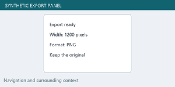
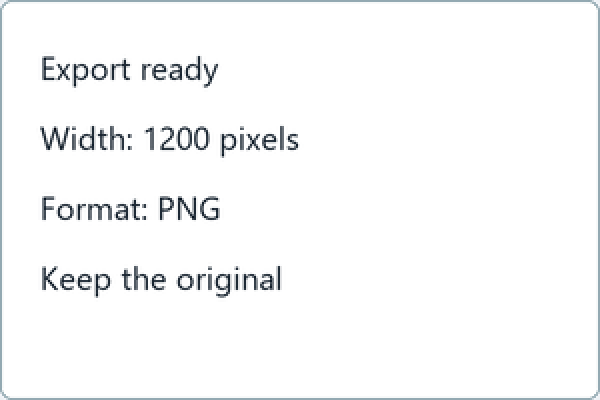
No human reading study or OCR accuracy test was run. We have not measured a threshold at which all viewers can read a screenshot, and we do not label eight or sixteen pixels as universally failing or passing. The reproducible result here is the output geometry, the retained content and the known text-scale calculation. Font design, contrast, display size and viewing conditions still matter.
Repeat the choice using the same source
Download the complete 1,200 × 600 fixture, the 600-pixel full export, the 300-pixel full export, the unscaled panel crop and the 300-pixel excerpt. The source and exact crop make it possible to compare the layouts without confusing a tighter framing with a better resizing algorithm.
Can sharpening make the small version equivalent to the original?
Sharpening changes local contrast; it does not restore the original pixel grid or editable text layer. Compare the actual exported file at its intended viewing size. If important words remain ambiguous, use a larger excerpt or share the text itself alongside the image.
What if the full interface must stay visible?
Keep the full capture and add a separate detail image with an explicit label. That gives the receiver context and a closer view. Avoid choosing a crop that hides a warning, changes the meaning of a message or removes information needed to understand it.
Allocate the final width to the content the reader needs. Keep context available, and judge the saved export where it will actually be viewed.
More resizing examples →